New Wall Art
Glitch on Plaster 🔗
I recently received some new prints that immediately went into frames and made their way on to my wall. They’re all from Rob Sheridan. I first learned about Rob from his time as the Creative Director of Nine Inch Nails, and I’ve enjoyed following his work since then.
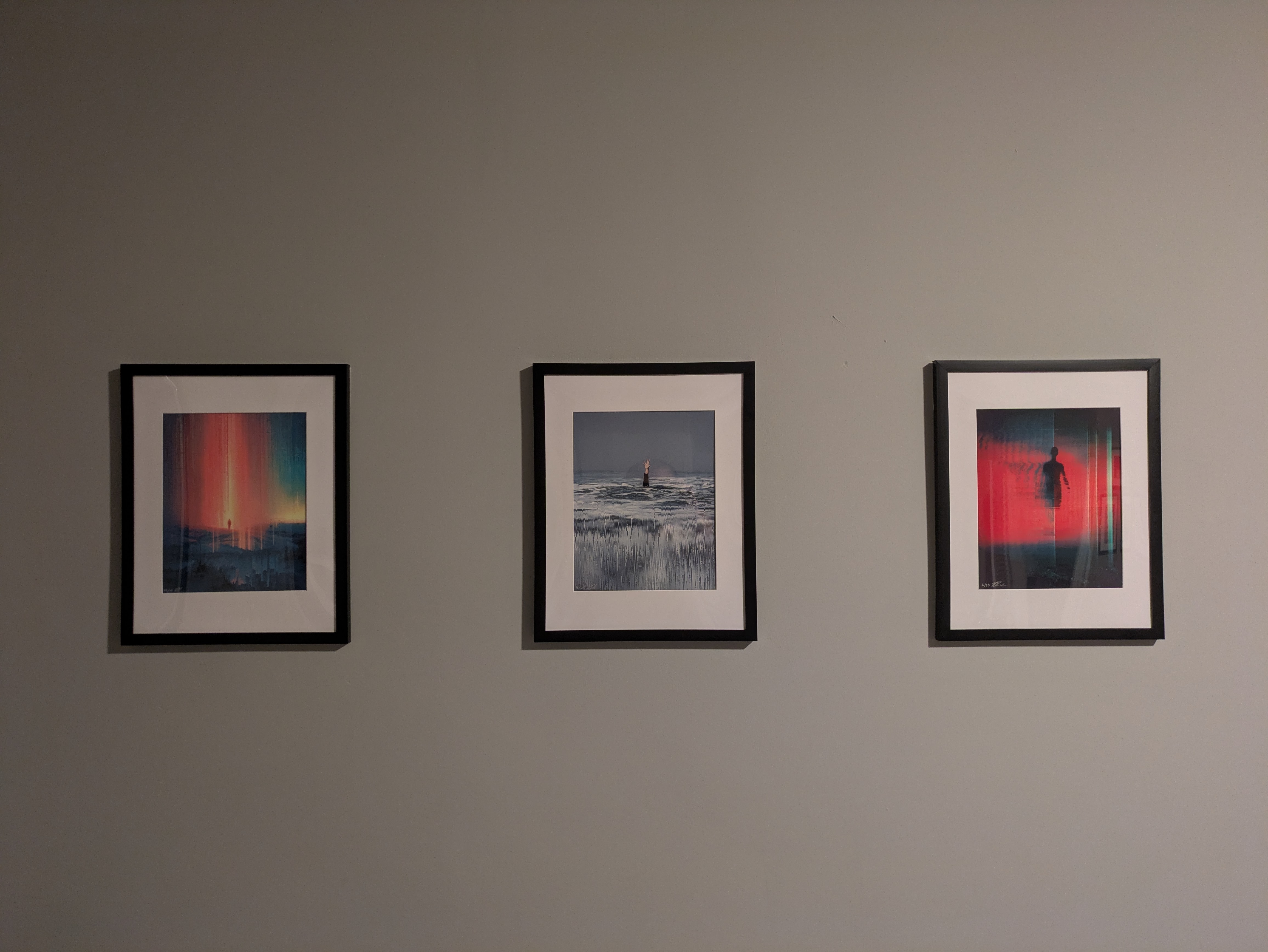
These are all poorly-taken phone camera pictures of high-quality prints from within frames. Trust that the quality of images you see in front of you do not do justice to their true representation.
Precipice (second edition) 🔗
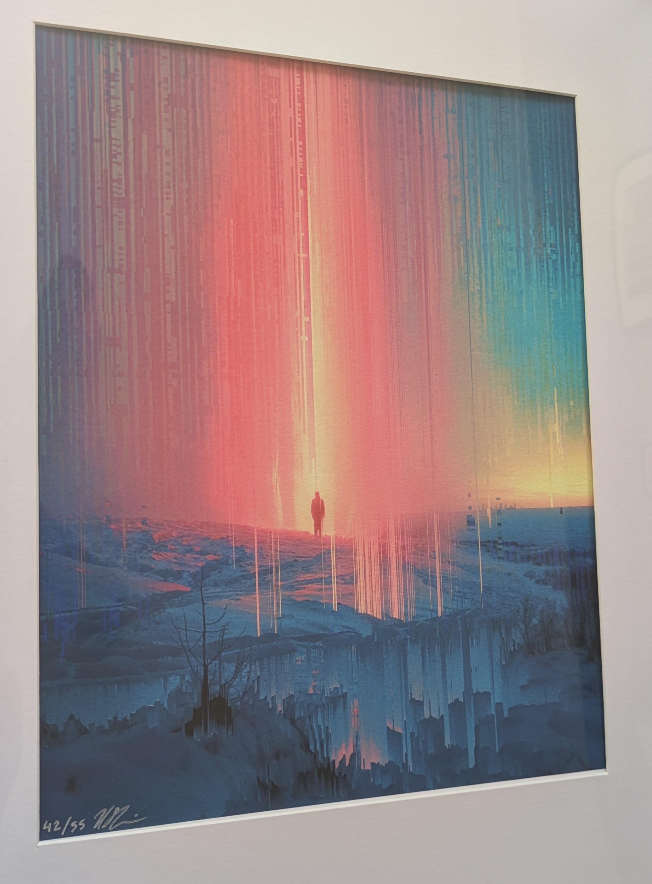
Rob provides some context about this piece:
The allure and fear of the unknown; the double-edged sword of feeling like anything is possible, for better or worse. The warm glow of possibility corrupted by an ominous existential dread that the ground beneath us is eroding, and the light on the horizon is cracking apart; that we stand on a fragile precipice where hope and fear are intertwined; the more love you have, the more you have to lose.
As you might be able to tell, I’m drawn to Rob’s centering of an individual in disparate environments around them. I see the glitch around the figure here as both a prison and a protective layer between them and the outside world. Which it’s acting as at the moment depends on your perspective and frame of mind.
I have print 42/55; you should get yours.
Reach (remastered vertical edition) 🔗
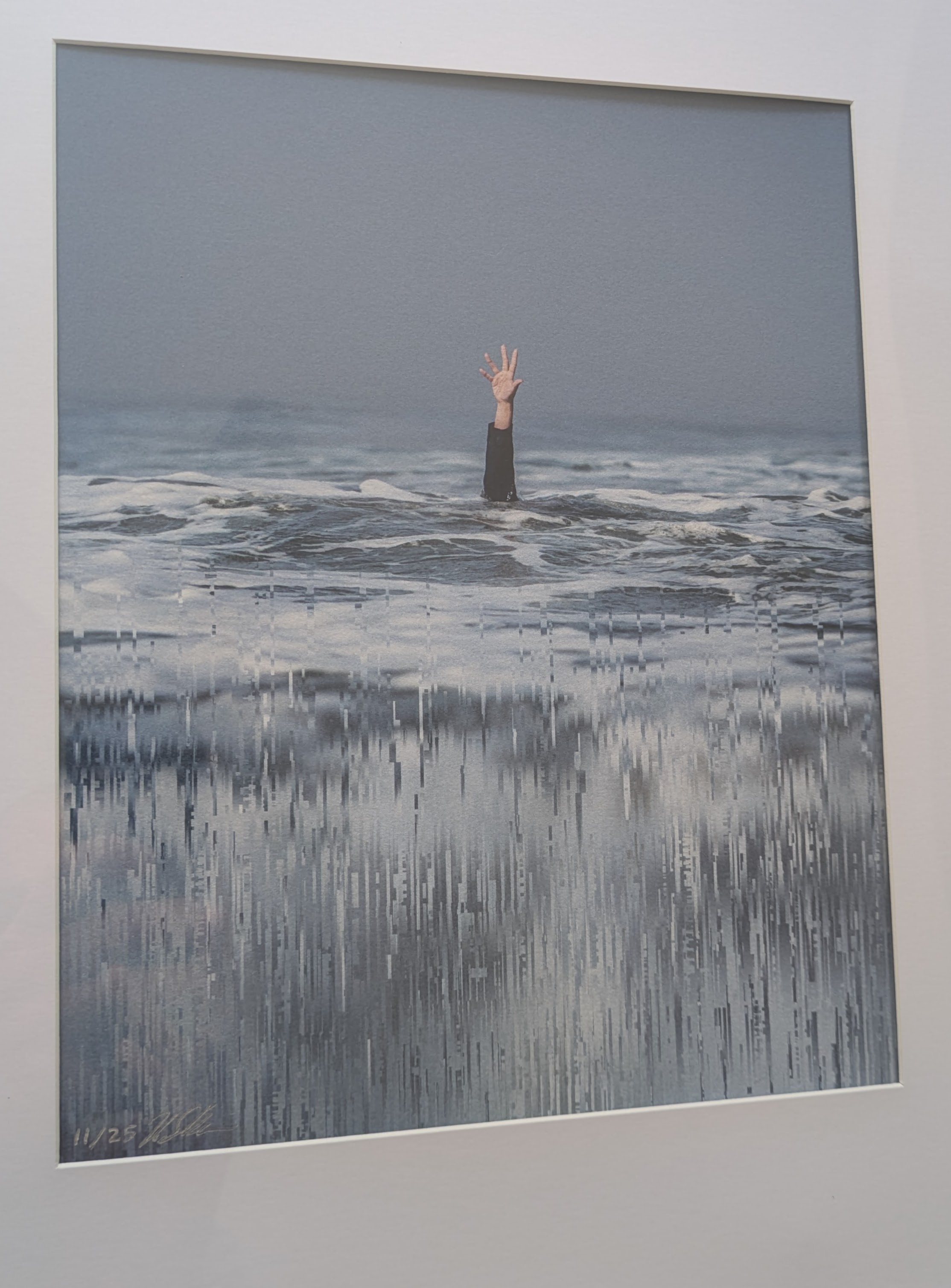
I spend the majority of my daily life attempting to provide instructions to a computer. Navigating a literal digital sea. We spend untold amounts of time wading in artifices meant to evoke experiences similar to, but not quite matching, the physical world.
It can take so much energy and effort to pull yourself up from those depths. To seek connection. You can succeed in extending yourself to meet the world only to find…no one is there.
I have print 11/25; you should get yours.
Turbulence 🔗
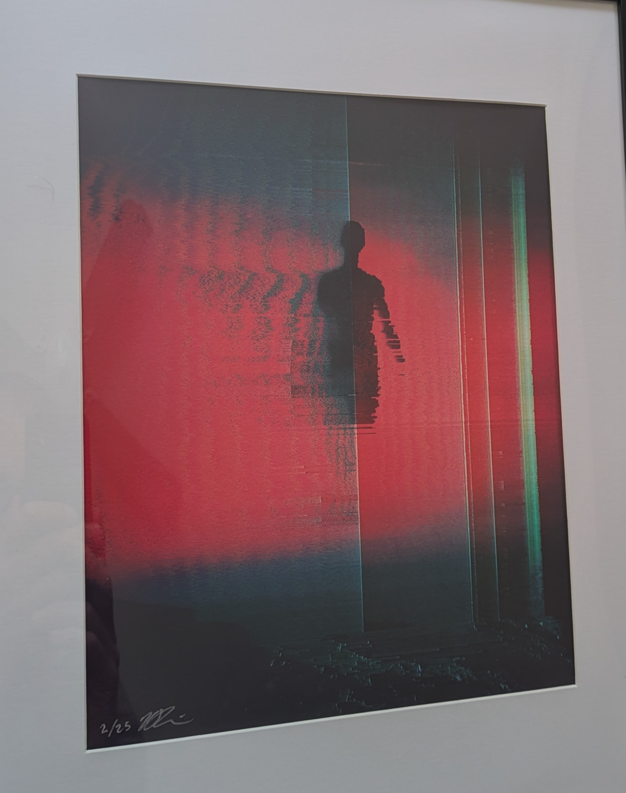
A new glitch piece about surviving, rising above, holding on to yourself when it feels like you’re coming apart.
This is the image that evokes the most visceral reaction in me. Unfortunately, I find myself struggling to explain it accurately. Something about the degradations of the repeating figure really gets me. The color palette feels both ominous while still warm and inviting. Like I belong there, but I don’t know if I want to be there.
I have print 2/25; you should get yours.
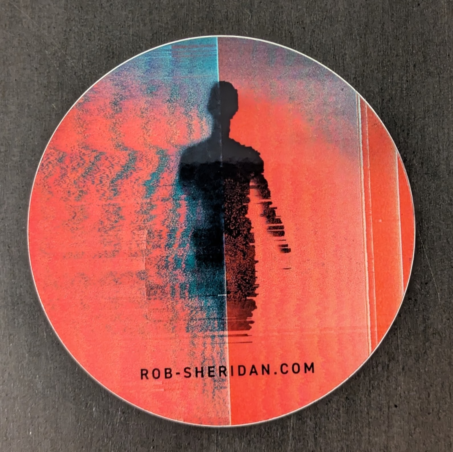
Bonus 🔗
Rob and Steph were kind enough to include a sticker with a personalized note. Whether or not any of these pieces speak to you, I suggest checking out the rest of Rob’s store and work.
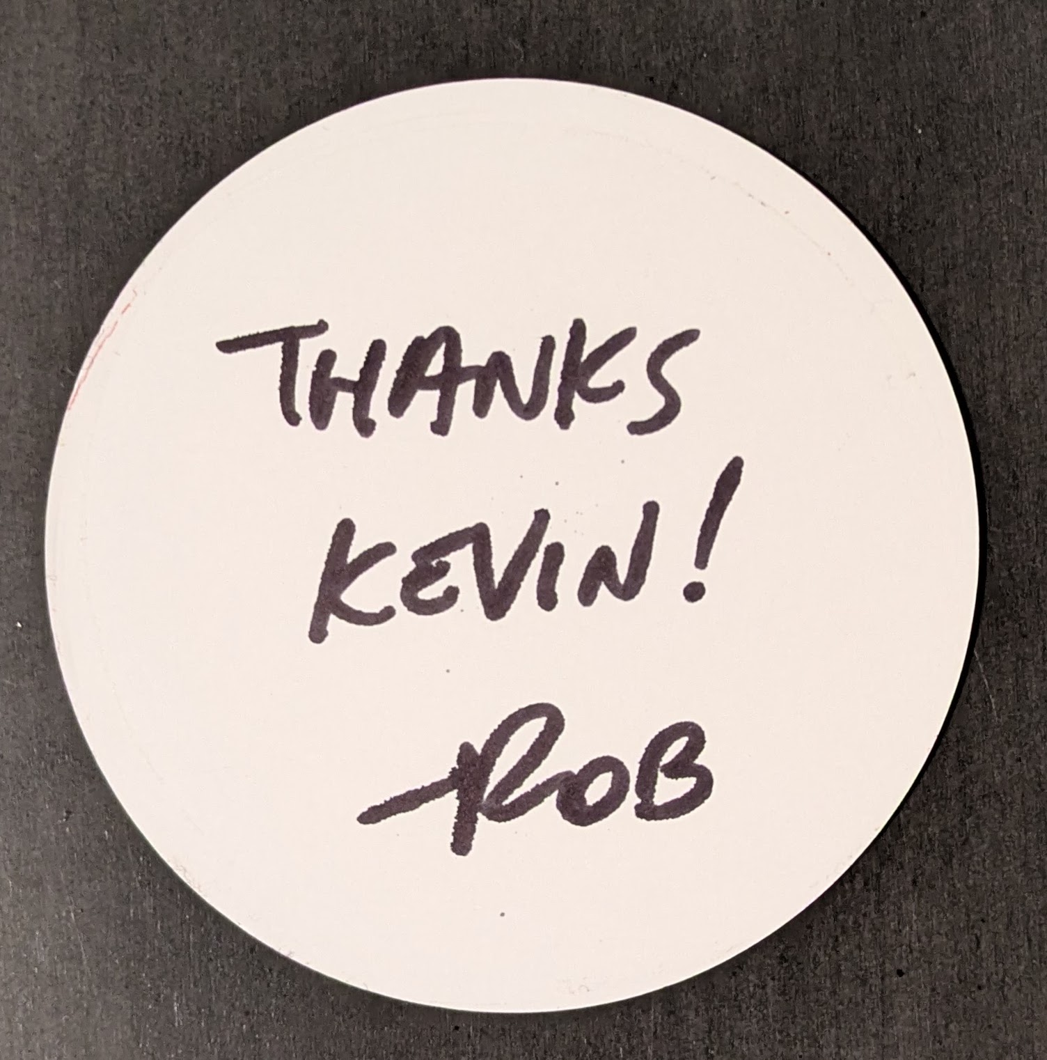
Thank you, Rob.